


Figma Essentials: Building Your Portfolio Website
Figma Essentials: Building Your Portfolio Website
Figma Essentials: Building Your Portfolio Website
Figma Essentials: Building Your Portfolio Website
Welcome to my Figma course for beginners. In this course, you will learn what Figma is, who it is for, and why to use it. This course is mainly for junior designers who need to learn how to use Figma. However, this course can be helpful for anyone who needs to learn how to work with Figma for their everyday work.
Welcome to my Figma course for beginners. In this course, you will learn what Figma is, who it is for, and why to use it. This course is mainly for junior designers who need to learn how to use Figma. However, this course can be helpful for anyone who needs to learn how to work with Figma for their everyday work.
Last updated 07/03/2024
Last updated 07/03/2024
|
Created by Ofir Kitlaru
Created by Ofir Kitlaru
Course content
Course content
I have created a Figma file to show what you'll make throughout this course. Feel free to refer to it anytime to ensure you're on the right track.
I have created a Figma file to show what you'll make throughout this course. Feel free to refer to it anytime to ensure you're on the right track.
What is Figma?
What is Figma?
Figma is a design collaboration tool that enables all parties involved in the design process to work together on the same project simultaneously. This means product designers, developers, product managers, and content creators can all collaborate in real time. Figma allows designers to design various digital products such as websites, applications, SaaS products, and more.
Figma is a design collaboration tool that enables all parties involved in the design process to work together on the same project simultaneously. This means product designers, developers, product managers, and content creators can all collaborate in real time. Figma allows designers to design various digital products such as websites, applications, SaaS products, and more.
How to get Figma?
How to get Figma?
To get Figma, you need to go to the company's website at https://figma.com and sign up for a free account by clicking on the "Get started for free" button. You'll need to confirm the email address you signed up with, and after that, you'll get access to Figma. They have a short onboarding process, but you can start designing after that!
You can work on Figma from your browser or download it to your computer. If you prefer to work with the desktop version, all you need to do is click on your name at the top left of the screen and click "Get desktop app".
The basics
The basics
Now, I want to talk about the basics of Figma, but first, we need to create a new design file. The way to do it is by clicking on the "Design file" button drop-down on the top right of the screen and clicking Drafts.
Now, I want to talk about the basics of Figma, but first, we need to create a new design file. The way to do it is by clicking on the "Design file" button drop-down on the top right of the screen and clicking Drafts.
Now that you've created a new design file, let's review the user interface. As you can see, the UI consists of different areas - the toolbar, left sidebar, right sidebar, and the canvas.
Now that you've created a new design file, let's review the user interface. As you can see, the UI consists of different areas - the toolbar, left sidebar, right sidebar, and the canvas.
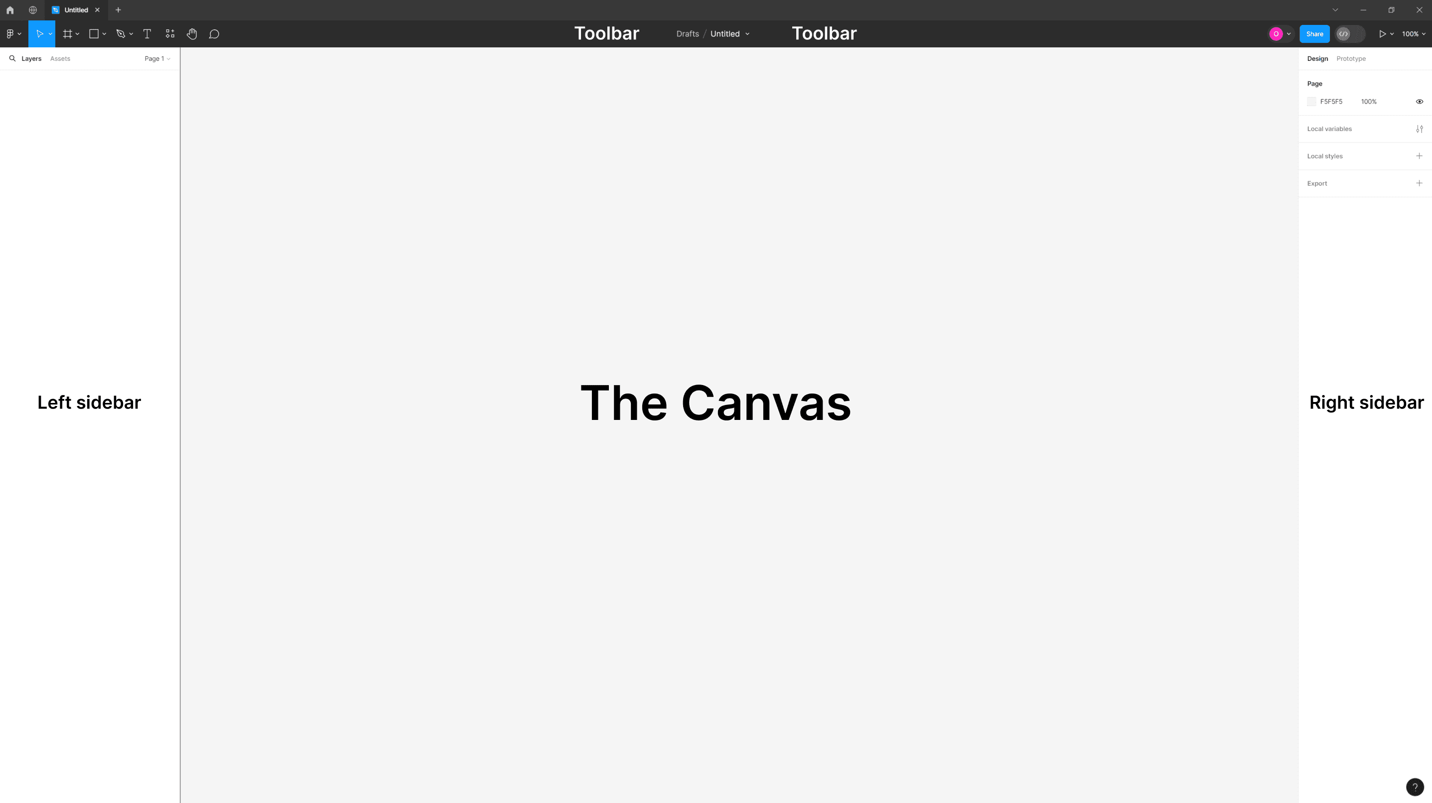
The toolbar is located at the top of the UI and has four groups of tools in it. You can find the tools for creating your designs on the toolbar's left side (next to Figma's logo). Among them, you can see the rectangle tool, the frame tool, the text tool, and more.
Next, we have the actions group located at the center of the toolbar. When no layer is selected, the actions group options allow you to view file history, publish a library, export design elements, and more. When a layer is selected, you'll see different options, such as editing an object, creating a component, or creating a mask.
We can find the collaboration and view options groups on the right side of the toolbar.
The collaboration group lets you share your designs and work with your co-workers or clients in real time. You can also see who else works on the file and view or change the permissions of each member and more.
In the view options group, you can adjust your view, zoom in and out, view prototypes, and more.
You can manage your layers, assets, and pages in the left sidebar.
In the right sidebar, you can get more information about your designs. When a layer is selected, you can view and edit its properties. If you don't have any layer selected, you can view local resources like color, effects, and text styles.
Finally, we have the canvas. This is where you'll do the work and create your designs. As you can see, you have more than plenty of room for your designs. However, it's important to remember that having too many design elements on a single page may cause performance issues in Figma. To avoid this, consider transferring some of the designs to different pages.
That's it for the basics. Now, we can start having fun and get creative!
Frames
Frames
The first thing we'll do is create a frame for our first design.
Frames allow us to create areas in the canvas and build our designs inside of them. If I'm designing for a specific screen size or device, frames allow me to create a container for my designs. For example, if I'm designing an app, the frame I'll make will be the size of a phone, say iPhone 14, and not the size of a desktop screen. In this way, I can ensure that my design looks and works well within the resolution limits of iPhone 14.
So, let's create a frame using the keyboard shortcut F. After pressing F, look at the right sidebar. It changed. When you select the frame tool, the right sidebar will show presets of popular frame sizes.

Select the Desktop frame that has a resolution of 1440 X 1024. Great, now it should be visible on your canvas. You can also select the frame tool from the toolbar, but using the shortcut is more efficient. In addition, you can create a frame with a custom size by clicking and dragging the cursor on the canvas. Once your frame is on the canvas, you can change its width and height properties by selecting it and changing the properties from the right sidebar. Another thing: When selecting the frame tool, you can click anywhere on the canvas to create a 100 X 100 frame.
Select the Desktop frame that has a resolution of 1440 X 1024. Great, now it should be visible on your canvas. You can also select the frame tool from the toolbar, but using the shortcut is more efficient. In addition, you can create a frame with a custom size by clicking and dragging the cursor on the canvas. Once your frame is on the canvas, you can change its width and height properties by selecting it and changing the properties from the right sidebar. Another thing: When selecting the frame tool, you can click anywhere on the canvas to create a 100 X 100 frame.

Layout grid
Layout grid
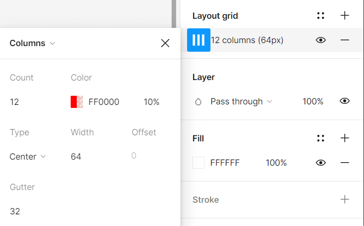
The layout grid is a visual tool that helps us align objects in a frame for consistent and logical designs. So, now I will show you how to create a layout grid. The first thing you need to do is to choose the frame you just created. Now, go to the right sidebar and look for a "Layout grid" section. Click on the plus icon on the right, then open the Layout grid settings (located on the left side). In the layout grid settings, click on the drop-down menu (where it says Grid) and choose Columns.
For this frame size, I used the following settings:
Count: 12
Type: Center
Width: 64
Gutter: 32
Now that you have created a layout grid, your frame is divided into 12 red columns (or whatever color you choose in the layout grid settings). You can toggle the layout grid view using the keyboard shortcut SHIFT + G (Windows and Mac).
You can also show or hide the layout grid view by selecting your frame, and in the right sidebar, click on the eye icon in the Layout grid section. It's important to remember that if you use this method and you turn the visibility off, the shortcut won't work. You must ensure the eye icon is turned on to use the keyboard shortcut.

Designing the navigation
Designing the navigation
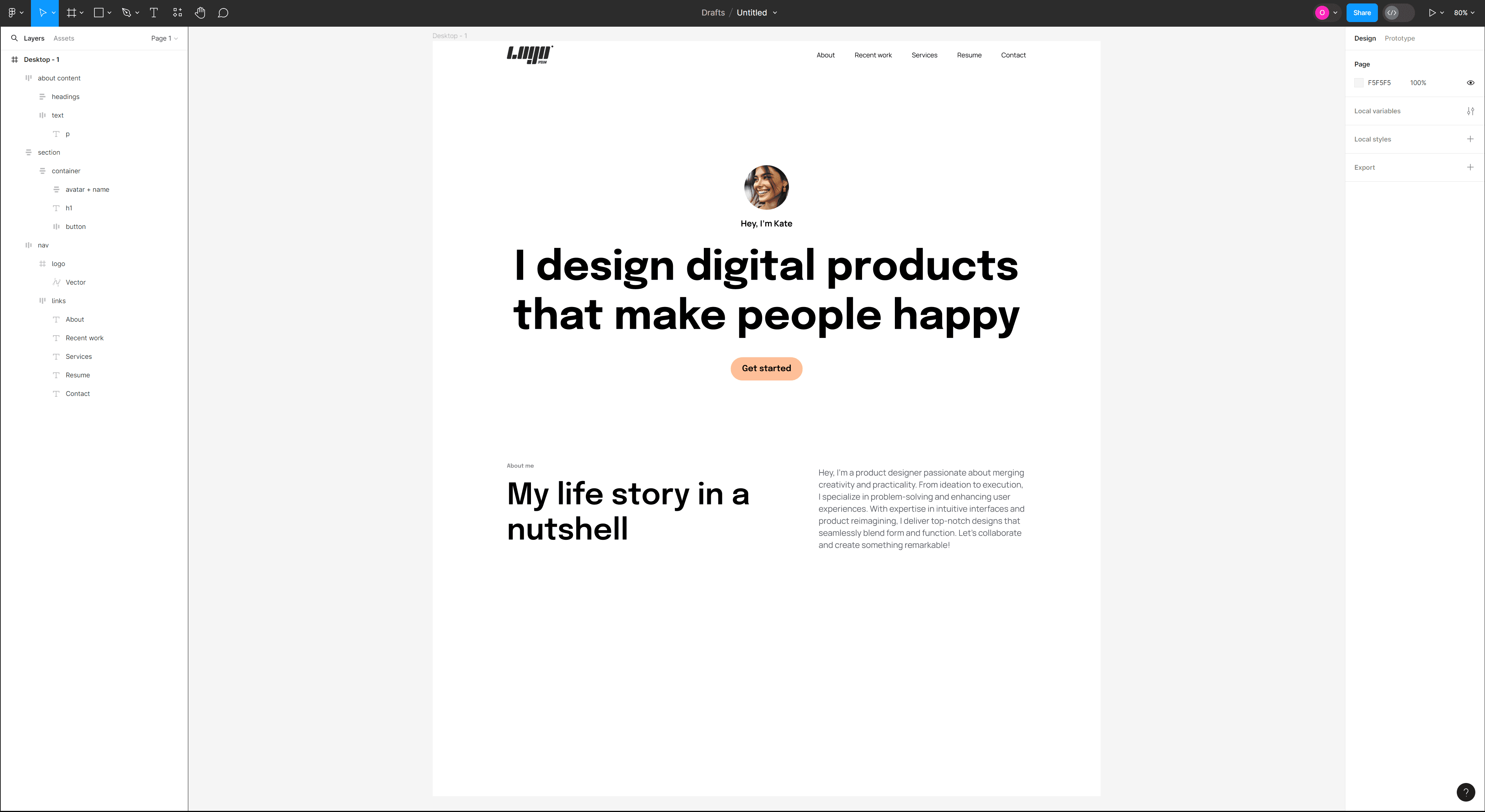
Now, it's time to build the navigation of the website we will design. So first, we'll grab the text tool from the toolbar or use the T keyboard shortcut.
Now, it's time to build the navigation of the website we will design. So first, we'll grab the text tool from the toolbar or use the T keyboard shortcut.

With the text tool selected, click inside the frame and type "About." Next, I want to duplicate the text layers four more times, so to do that, I select the text layer, hold the ALT key on Windows or the OPTION key on Mac, drag the duplicated layer, and place it next to the first layer. I can also duplicate a layer using the CTRL + D (Windows) or COMMAND + D (Mac) keyboard shortcut. I want to change the text on the four layers I duplicated, so I'll click on each and change the text accordingly. These are the names of my navigation links—about, recent work, services, resume, and contact.
Next, I want to add a logo to my navigation. If you have a ready-made logo, you are welcome to use it. I will show how you can use a plugin called Logoipsum to add a mock logo to your designs. So to do that, go to the tools in the toolbar, and between the text and hand tools, you'll find the resources tool.

You can also access the resources tool using the keyboard shortcut SHIFT + I (Windows & Mac). After you open the resources tool, go to the Plugins tab and type "Logoipsum." Click on the result below, and now you can use the plugin. Choose any logo you'd like and click on it to bring it to your canvas. After the logo is placed on the canvas, drag it into the main frame from the layers panel on the left sidebar.
You can also access the resources tool using the keyboard shortcut SHIFT + I (Windows & Mac). After you open the resources tool, go to the Plugins tab and type "Logoipsum." Click on the result below, and now you can use the plugin. Choose any logo you'd like and click on it to bring it to your canvas. After the logo is placed on the canvas, drag it into the main frame from the layers panel on the left sidebar.

What is auto layout?
What is auto layout?
Now it's time to learn about a tool that will enhance your work and save you time. This tool is called Auto Layout. Auto Layout is a property that can be added to frames and components (we'll learn about components a bit later). It enables us to create flexible and dynamic designs that respond to changes in content and layout size.
Now it's time to learn about a tool that will enhance your work and save you time. This tool is called Auto Layout. Auto Layout is a property that can be added to frames and components (we'll learn about components a bit later). It enables us to create flexible and dynamic designs that respond to changes in content and layout size.

Now, let's see the auto layout property in action. Select all the text layers you've created and press SHIFT + A (Windows or Mac) to wrap the layers inside an auto layout frame. With the new auto layout frame selected, go to the left sidebar, double-click on the layer name, and change it to "links." Next, select the logo layer and the links layer, press SHIFT + A to wrap them inside an auto layout frame, and call the frame "navigation" or "nav."
With the nav layer selected, go to the right sidebar, and in the "frame" section, you'll find the dimension properties. Change the width of the nav layer to 1440 pixels. In the Auto Layout section, set the Horizontal gap between items to Auto. It will push the layers inside the auto layout frame to the edges of the frame. Next, set the Horizontal padding to 160 to align the frame to the layout grid. Why 160? Because we're using a 12-column grid layout. Each column is evenly spaced, with a margin of 160 pixels on each side of the grid. This means there's a clear space of 160 pixels between the edge of the frame and the nearest grid line on all sides.

Designing the hero section
Designing the hero section
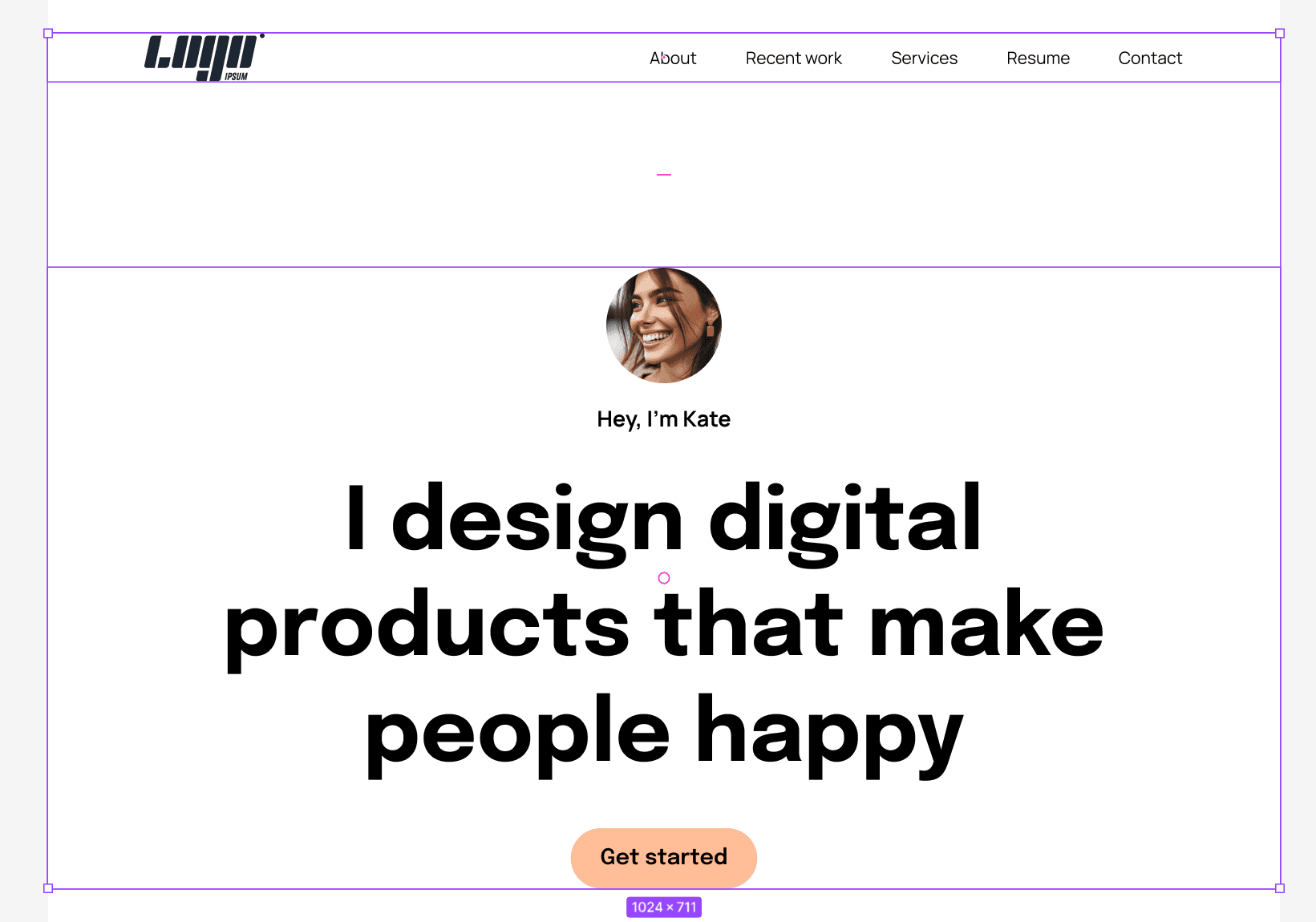
Next, we'll build the hero/welcome section.
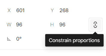
The first thing we need to add is an ellipse shape. You can pick the tool from the toolbar or use the keyboard shortcut O. Once the ellipse tool is selected, click on the canvas to create an ellipse shape of 100 pixels width by 100 pixels height. Then, change the dimensions in the right sidebar to 96 by 96 and click on the icon on the right to constrain the proportions. You can also hold the shift key, drag, and release when the ellipse tool is selected to create an ellipse.
Next, we'll build the hero/welcome section.
The first thing we need to add is an ellipse shape. You can pick the tool from the toolbar or use the keyboard shortcut O. Once the ellipse tool is selected, click on the canvas to create an ellipse shape of 100 pixels width by 100 pixels height. Then, change the dimensions in the right sidebar to 96 by 96 and click on the icon on the right to constrain the proportions. You can also hold the shift key, drag, and release when the ellipse tool is selected to create an ellipse.
Next, select the text tool using the keyboard shortcut "T" and write "Hey' I'm Kate," or whatever you want; mine is just a mock text. When the text layer is selected, go to the right sidebar, and under the "Text" section, click on the drop-down menu and type Manrope. This is the font we'll use for this layer. Under the font name, you can choose the font weight, so for this one, let's select Bold. Right next to it is the field where we can change the font size. Set the font size to 18 pixels and the line height to 26 (The line height field is located under the font weight drop-down).
Next, select the text tool using the keyboard shortcut "T" and write "Hey' I'm Kate," or whatever you want; mine is just a mock text. When the text layer is selected, go to the right sidebar, and under the "Text" section, click on the drop-down menu and type Manrope. This is the font we'll use for this layer. Under the font name, you can choose the font weight, so for this one, let's select Bold. Right next to it is the field where we can change the font size. Set the font size to 18 pixels and the line height to 26 (The line height field is located under the font weight drop-down).

Next, we'll add an image and create a mask inside the ellipse shape. In my case, I downloaded an image from Freepik's website, but I want to show you a plugin you can use to insert mock images in Figma. So click SHIFT + I (Windows and Mac) to open up the resources tool, go to the Plugins tab, and search for the UI Faces plugin. Click to install, and after that, you can select from a wide range of mock images for your designs.
Next, we'll add an image and create a mask inside the ellipse shape. In my case, I downloaded an image from Freepik's website, but I want to show you a plugin you can use to insert mock images in Figma. So click SHIFT + I (Windows and Mac) to open up the resources tool, go to the Plugins tab, and search for the UI Faces plugin. Click to install, and after that, you can select from a wide range of mock images for your designs.

While the plugin is open, click on the ellipse shape, then click on an image you like. It places the image in the ellipse. Give it a try. If you have a different image you would like to use, and it's on your hard drive, drag it from the folder and drop it in Figma. In that case, you must create a mask to place it inside the ellipse shape. So, to do that, select the image and the ellipse shape, and in the toolbar actions group, click on Use as mask or use the keyboard shortcut CTRL + ALT + M (Windows), or CONTROL + COMMAND + M (Mac).
Note: Make sure that the ellipse shape is behind the image; otherwise, you won't be able to create a mask. If your shape is in front of the image and you want to move it behind it, press CTRL + [ (Windows) or COMMAND + [ (Mac).
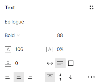
Next, we'll create the big heading for our hero. Select the text tool and type "I design digital products that make people happy," or whatever you want. When the text layer is selected, go to the right sidebar and change the font to Epilogue, the weight to Bold, the size to 88, and the line height to 106.
While the plugin is open, click on the ellipse shape, then click on an image you like. It places the image in the ellipse. Give it a try. If you have a different image you would like to use, and it's on your hard drive, drag it from the folder and drop it in Figma. In that case, you must create a mask to place it inside the ellipse shape. So, to do that, select the image and the ellipse shape, and in the toolbar actions group, click on Use as mask or use the keyboard shortcut CTRL + ALT + M (Windows), or CONTROL + COMMAND + M (Mac).
Note: Make sure that the ellipse shape is behind the image; otherwise, you won't be able to create a mask. If your shape is in front of the image and you want to move it behind it, press CTRL + [ (Windows) or COMMAND + [ (Mac).
Next, we'll create the big heading for our hero. Select the text tool and type "I design digital products that make people happy," or whatever you want. When the text layer is selected, go to the right sidebar and change the font to Epilogue, the weight to Bold, the size to 88, and the line height to 106.
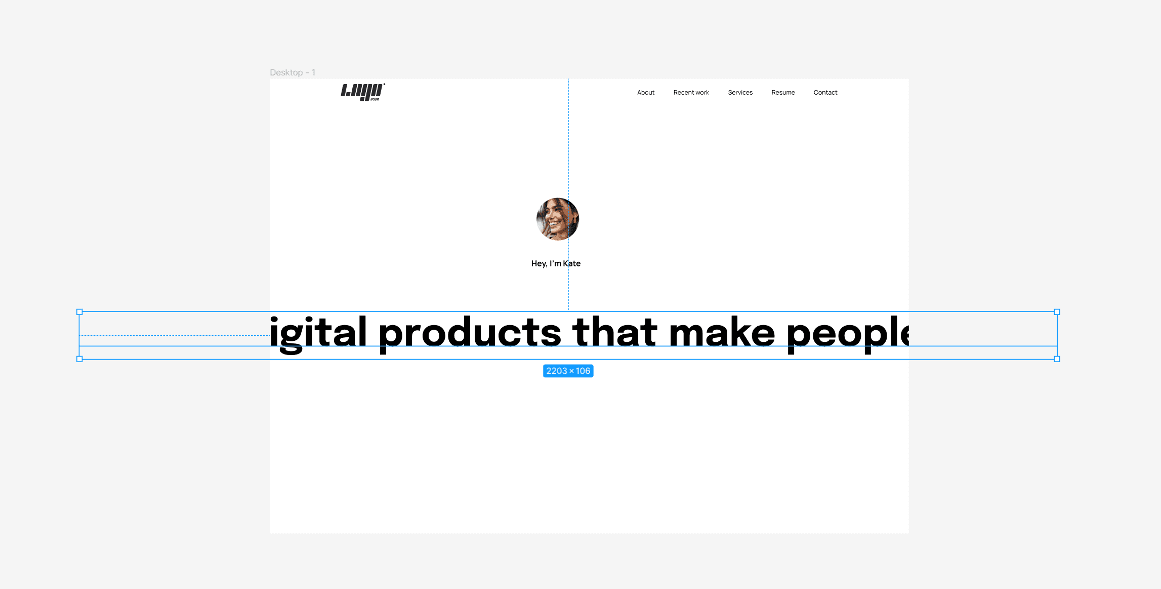
Now, the text is too big for the frame, so to correct it, first open the layout grid view using the keyboard shortcut SHIFT + G (Windows and Mac), then select the text layer. When the layer is selected, you'll notice a blue border around it. Drag one of the edges and align it to the layout grid; once you're done with one side, do the other. A more efficient way of doing this is dragging one side and holding the ALT key (Windows), or the OPTION Key(Mac) to resize both sides simultaneously.
Now, the text is too big for the frame, so to correct it, first open the layout grid view using the keyboard shortcut SHIFT + G (Windows and Mac), then select the text layer. When the layer is selected, you'll notice a blue border around it. Drag one of the edges and align it to the layout grid; once you're done with one side, do the other. A more efficient way of doing this is dragging one side and holding the ALT key (Windows), or the OPTION Key(Mac) to resize both sides simultaneously.
After that, we will create the subheading. You can select the big heading and duplicate it - CTRL + D (Windows) or COMMAND + D (Mac). Afterward, go to the right sidebar and change the font size to 24 pixels, the weight to regular, and the line height to 34.
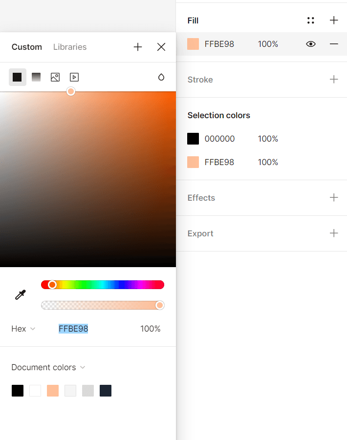
After that, we will create a button for this section. Press T to select the text tool and type Get started. Go to the right sidebar, and under the font settings, change the font to Epilogue, the size to 18 pixels, the weight to Semibold, and the line height to 26. Then, use the keyboard shortcut to wrap the text layer with an auto layout frame (SHIFT + A). Find the Fill heading on the right sidebar and press the plus icon on the right side. You've just added a white fill to your auto layout frame, so let's change the color. Click on the box from the left of the name of the color, and in the HEX field, paste this color code: FFBE98.
After that, we will create the subheading. You can select the big heading and duplicate it - CTRL + D (Windows) or COMMAND + D (Mac). Afterward, go to the right sidebar and change the font size to 24 pixels, the weight to regular, and the line height to 34.
After that, we will create a button for this section. Press T to select the text tool and type Get started. Go to the right sidebar, and under the font settings, change the font to Epilogue, the size to 18 pixels, the weight to Semibold, and the line height to 26. Then, use the keyboard shortcut to wrap the text layer with an auto layout frame (SHIFT + A). Find the Fill heading on the right sidebar and press the plus icon on the right side. You've just added a white fill to your auto layout frame, so let's change the color. Click on the box from the left of the name of the color, and in the HEX field, paste this color code: FFBE98.
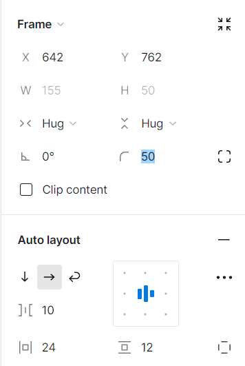
We're almost done with this section but still have more to improve. Select the button you've just created, and on the right sidebar, change the corner radius to 50 in the frame properties. In the auto layout properties, change the horizontal padding to 24 pixels and the vertical padding to 12.
We're almost done with this section but still have more to improve. Select the button you've just created, and on the right sidebar, change the corner radius to 50 in the frame properties. In the auto layout properties, change the horizontal padding to 24 pixels and the vertical padding to 12.
Now, select all the layers of the hero section, press SHIFT + A to create an auto layout frame, and change the frame's name to section. On the right sidebar, change the width of the frame to 1440 pixels and press ALT + H (Windows), or OPTION + H (Mac) to align the horizontal centers. Press ENTER when the frame is selected, and create another auto layout frame (SHIFT + A). Call this frame container. Select the section frame, and in the right sidebar, change the settings of the horizontal padding in the auto layout section to 160. Next, select the container frame and change the Horizontal resizing settings to Fill container in the frame properties on the right sidebar.
Select the avatar image and the text below it, create an auto layout frame, and call it avatar + name. Now, on the auto layout properties in the right sidebar, set the Vertical gap between items to 16. Select the container frame and change the Vertical gap between items to 32.
To keep our layers organized, select the big heading and change its name to h1. Then select the subheading and change its name to p. This is an excellent practice for staying organized and helping those working with you navigate your designs easily.

Designing the about section
Designing the about section
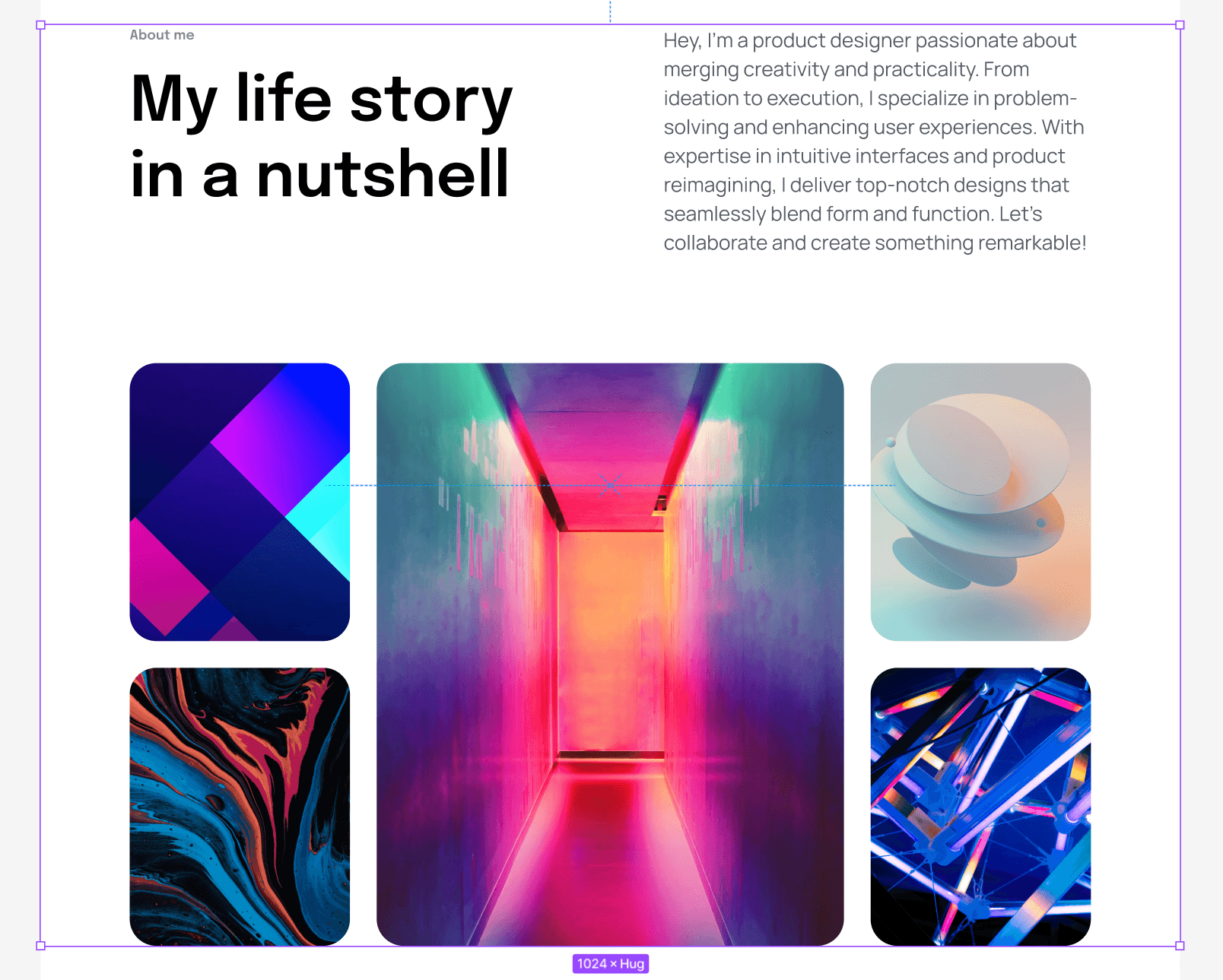
Now, it's time to build the About section.
The first thing we'll do is to create a big heading for this section. So grab the text tool (T) and type "My life story in a nutshell." Now, change the font to Epilogue, the size to 64, the weight to SemiBold, and the line height to 76, and name this layer h2. Press T again and type "About me." The font here is also Epilogue, the size is 12, the weight is SemiBold, and the line height is 20. Name this layer small. Select both layers, create an auto layout frame (SHIFT + A), name it headings, and set the Vertical gap between items to 16.
Create a new text layer and add some text to it. Call this layer p, place it inside an auto layout frame, and name it text. Select both frames (headings and text), create another auto layout frame, name it "about content," and set the auto layout direction to a horizontal layout. Change the Horizontal gap between items of "about content" to 128. In the frame properties on the right sidebar, change the width of headings to 544.
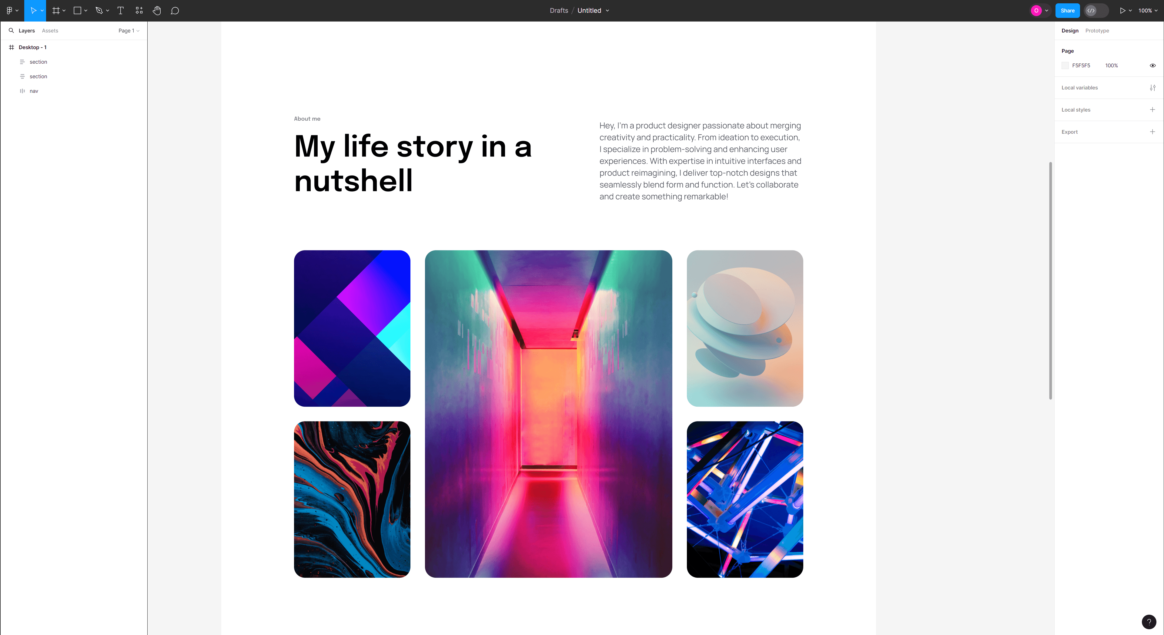
Next, we'll create the image grid, but first, we need images. Feel free to drag and drop five images from your computer, or you can use a plugin called Unsplash to insert images into Figma. To install this plugin, open the resources tool, go to the plugins tab, and type the Unsplash. After you install the plugin, choose the images you'd like to have on the grid.
Next, we'll create the image grid, but first, we need images. Feel free to drag and drop five images from your computer, or you can use a plugin called Unsplash to insert images into Figma. To install this plugin, open the resources tool, go to the plugins tab, and type the Unsplash. After you install the plugin, choose the images you'd like to have on the grid.

Open the layout grid view by pressing SHIFT + G (Windows and Mac). Place one image in the middle of the grid, create an auto layout frame, and call it image wrapper. Now, the frame should have a width of 6 columns or 544 pixels and a height of 720 pixels. So go to the right sidebar and change the dimensions. Select the image inside the image wrapper frame and change the Horizontal and Vertical resizing to Fill container.
Place the second image to the left of the first image, create an auto layout frame, and name it image wrapper. This frame should take the width of 3 columns or 256 pixels and 344 in height.
Follow this process for the third, fourth, and fifth images. This means that the images on the sides should all have a width of 256 pixels and 344 pixels in height.
Now that you have set up the image grid select the two images on the left, create an auto layout frame, set the Vertical gap between items to 32, and call it left. Select the image in the middle, create an auto layout frame, and call it center. Finally, select the images on the right, create an auto layout frame, set the Vertical gap between items to 32, and call it right. Next, select all the frames that make the grid (left, center, right), create another auto layout frame, set the Horizontal gap between items to 32, and call it image grid.
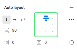
Now select the about content and image grid frames, create an auto layout frame, set the Vertical gap between items to 96, and call it container. Create another auto layout frame when container is selected and call the new frame section. Set the width of the section to 1440 pixels, and align the horizontal centers using the keyboard shortcut ALT + H (Windows), or OPTION + H (Mac). Change the horizontal padding to 160 and set the vertical padding to 0.
Now, we'll build the services section.
Open the layout grid view by pressing SHIFT + G (Windows and Mac). Place one image in the middle of the grid, create an auto layout frame, and call it image wrapper. Now, the frame should have a width of 6 columns or 544 pixels and a height of 720 pixels. So go to the right sidebar and change the dimensions. Select the image inside the image wrapper frame and change the Horizontal and Vertical resizing to Fill container.
Place the second image to the left of the first image, create an auto layout frame, and name it image wrapper. This frame should take the width of 3 columns or 256 pixels and 344 in height.
Follow this process for the third, fourth, and fifth images. This means that the images on the sides should all have a width of 256 pixels and 344 pixels in height.
Now that you have set up the image grid select the two images on the left, create an auto layout frame, set the Vertical gap between items to 32, and call it left. Select the image in the middle, create an auto layout frame, and call it center. Finally, select the images on the right, create an auto layout frame, set the Vertical gap between items to 32, and call it right. Next, select all the frames that make the grid (left, center, right), create another auto layout frame, set the Horizontal gap between items to 32, and call it image grid.
Now select the about content and image grid frames, create an auto layout frame, set the Vertical gap between items to 96, and call it container. Create another auto layout frame when container is selected and call the new frame section. Set the width of the section to 1440 pixels, and align the horizontal centers using the keyboard shortcut ALT + H (Windows), or OPTION + H (Mac). Change the horizontal padding to 160 and set the vertical padding to 0.
Now, we'll build the services section.
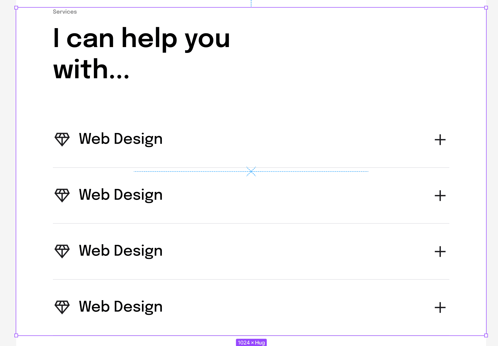
Designing the services section
Designing the services section
We'll start with the headings, and we can save time by duplicating the headings auto layout frame from the About section. Now, all that is left is to paste it outside the About section and change the text. Change the small heading text to services, and change the text of the large heading to I can help you with...
Now, let's create headings for each of the services we offer. Grab the text tool (T) and type Web Design. Set the font size to 32 pixels, the line height to 40, and change the layer's name to h4.
Now, let's install another plugin named Material Symbols. This plugin allows us to insert icons into Figma. So go ahead and open the resources tool, switch to the plugins tab, and search for the plugin. Choose an icon and close the plugin.

Select the icon and the text layers, create an auto layout frame (SHIFT + A), name it icon + service name, and set the Horizontal gap between items to 16. Click on the layer of the icon, go to the right sidebar, and set the height and width to 40 pixels. Open Material Symbols again by pressing the keyboard shortcut CTRL + ALT + P (Windows) or OPTION + COMMAND + P (Mac), and in the search bar, type add. Find the plus icon and click on it to insert it into Figma.
Select the plus icon you've just imported and the icon + service name frame, create an auto layout frame, and name it service. Now duplicate service three more times by holding the ALT key (Windows) or the OPTION key (Mac), dragging the duplicated layer below the original, releasing, and pressing CTRL + D (Windows) or COMMAND + D (Mac). You should now have four services. Feel free to leave it like that or change the names of the three services you duplicated.
Feel free to leave it like that or change the names of the three services you duplicated. If you want to change the icon, import a new one, either from your computer or a plugin, select the icon layer, copy or cut it, and then click on the icon you want to replace and press CTRL + SHIFT + R (Windows), or SHIFT + COMMAND + R (Mac). It will replace the old icon with the new one.
Select all four service frames, create an auto layout frame, and call it services. Next, select the headings and services frames, create a new auto layout frame, name it container, and set the Vertical gap between items to 96. Create another auto layout frame and name it section. Give the section a width of 1440 pixels, align horizontal centers by pressing ALT + H (Windows), or OPTION + H (Mac), and set the Horizontal padding to 160 and Vertical padding to 0.
Set the Horizontal resizing of container and services to Fill container. When services frame is selected, press ENTER to select all the frames inside it, change their Horizontal resizing to Fill container as well, and set the Horizontal gap between items to Auto. Now, the container auto layout frame fills the entire space available inside the section auto layout frame, and the services auto layout frame fills the entire space available inside container.
One last thing we need to add is a divider between each service. So to do that, select the services frame, grab the line tool using the keyboard shortcut "L," hold SHIFT, and draw a short line. When the line is selected, go to the right sidebar in the Frame properties and change the Horizontal resizing to Fill container. Duplicate the divider three more times and place each divider under each service. Select all the dividers, and in the Stroke section in the right sidebar, change the color to #2C333E, the opacity (next to it) to 30%, and the stroke size (below it) to 0.5.
Next up, we will be building the portfolio section.
Select the icon and the text layers, create an auto layout frame (SHIFT + A), name it icon + service name, and set the Horizontal gap between items to 16. Click on the layer of the icon, go to the right sidebar, and set the height and width to 40 pixels. Open Material Symbols again by pressing the keyboard shortcut CTRL + ALT + P (Windows) or OPTION + COMMAND + P (Mac), and in the search bar, type add. Find the plus icon and click on it to insert it into Figma.
Select the plus icon you've just imported and the icon + service name frame, create an auto layout frame, and name it service. Now duplicate service three more times by holding the ALT key (Windows) or the OPTION key (Mac), dragging the duplicated layer below the original, releasing, and pressing CTRL + D (Windows) or COMMAND + D (Mac). You should now have four services. Feel free to leave it like that or change the names of the three services you duplicated.
Feel free to leave it like that or change the names of the three services you duplicated. If you want to change the icon, import a new one, either from your computer or a plugin, select the icon layer, copy or cut it, and then click on the icon you want to replace and press CTRL + SHIFT + R (Windows), or SHIFT + COMMAND + R (Mac). It will replace the old icon with the new one.
Select all four service frames, create an auto layout frame, and call it services. Next, select the headings and services frames, create a new auto layout frame, name it container, and set the Vertical gap between items to 96. Create another auto layout frame and name it section. Give the section a width of 1440 pixels, align horizontal centers by pressing ALT + H (Windows), or OPTION + H (Mac), and set the Horizontal padding to 160 and Vertical padding to 0.
Set the Horizontal resizing of container and services to Fill container. When services frame is selected, press ENTER to select all the frames inside it, change their Horizontal resizing to Fill container as well, and set the Horizontal gap between items to Auto. Now, the container auto layout frame fills the entire space available inside the section auto layout frame, and the services auto layout frame fills the entire space available inside container.
One last thing we need to add is a divider between each service. So to do that, select the services frame, grab the line tool using the keyboard shortcut "L," hold SHIFT, and draw a short line. When the line is selected, go to the right sidebar in the Frame properties and change the Horizontal resizing to Fill container. Duplicate the divider three more times and place each divider under each service. Select all the dividers, and in the Stroke section in the right sidebar, change the color to #2C333E, the opacity (next to it) to 30%, and the stroke size (below it) to 0.5.
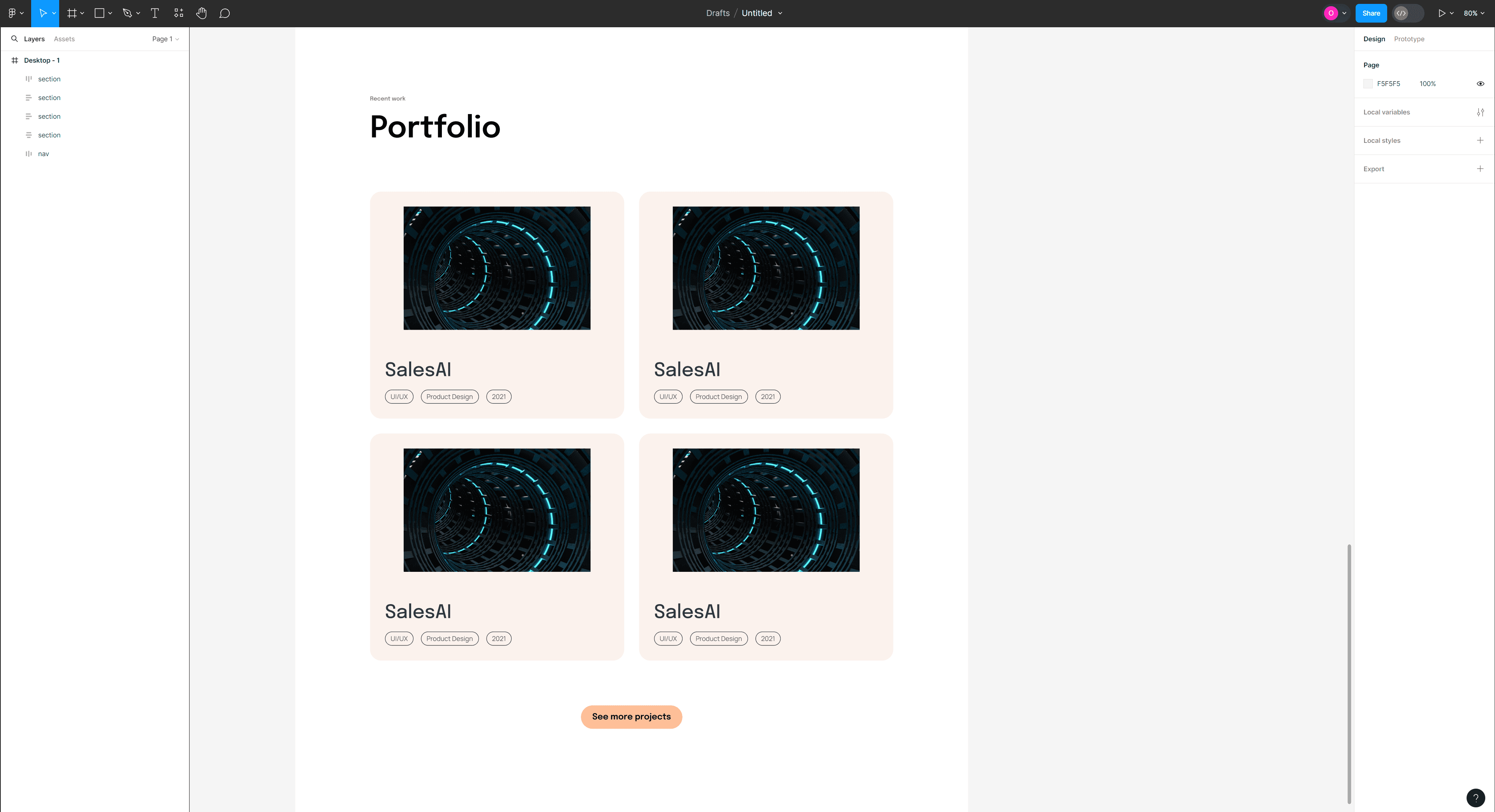
Next up, we will be building the portfolio section.

Designing the portfolio section
Designing the portfolio section
We'll start by duplicating the headings from the previous section. After you paste it under the services section, change the small heading to Recent work and the larger heading to Portfolio.
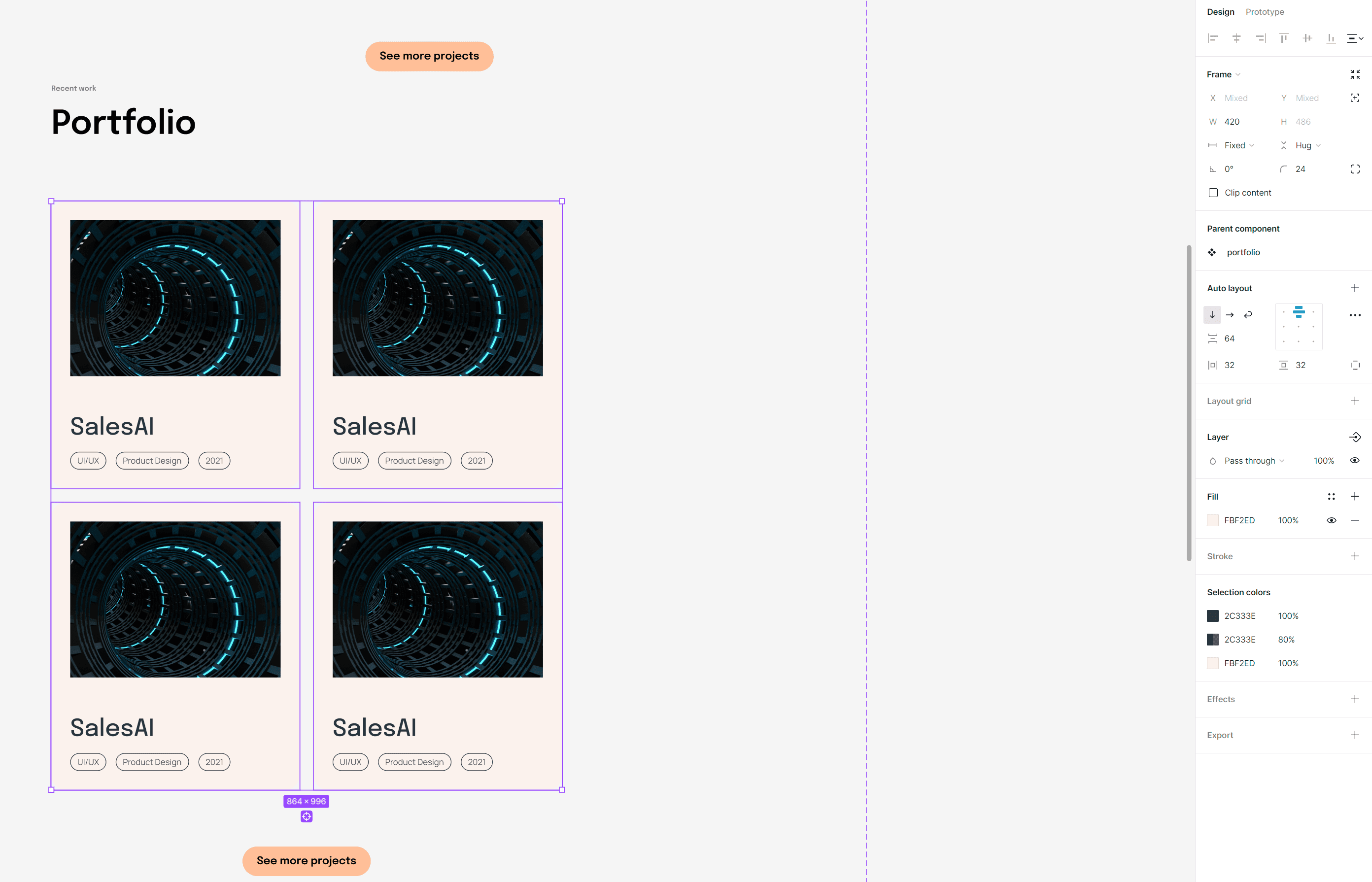
Create a new text layer and type the name of a project you've worked on, use a made-up one, or just write Project Name. Set the font to Epilogue, the weight to Medium, the size to 40, the line height to 48, and name it h3.
Create a new layer and label it with a category like UI/UX, product design, website design, etc. Change the font to Manrope, the weight to Regular, the size to 14, and the line height to 22. Press SHIFT + A to create a new auto layout frame and name it tag. In the frame properties on the right sidebar, set the corner radius to 50. In the Auto layout properties, set the Horizontal padding to 12 and the Vertical padding to 4.
Duplicate the tag frame two more times, select all the tag frames, create a new auto layout frame, and name it tags.
Select h3 and tags, create a new auto layout frame, and name it project info. Next, drag an image from your hard drive to Figma or insert one from the Unsplash plugin. Insert the image into a new auto layout frame, set the frame's Horizontal and Vertical padding to 0, and name it project image wrapper. Set the width of project image wrapper to 400 pixels and the height to 264 pixels. Ensure the image inside the auto layout frame properties of Horizontal and Vertical resizing are set to Fill the container, and name this layer img.
Select project info and project image wrapper frames, create a new auto layout frame, and name it project. Set the vertical gaps between items to 64, the horizontal and vertical padding to 32, change the fill color to #FBF2ED and set the corner radius to 24.
Duplicate the project frame three more times so that it's divided into two rows, each with two project frames. Select all project frames, create a new auto layout frame, and name it projects.
Copy the bottom from the hero section, paste it under the projects frame, and change the text to See more projects.
We'll start by duplicating the headings from the previous section. After you paste it under the services section, change the small heading to Recent work and the larger heading to Portfolio.
Create a new text layer and type the name of a project you've worked on, use a made-up one, or just write Project Name. Set the font to Epilogue, the weight to Medium, the size to 40, the line height to 48, and name it h3.
Create a new layer and label it with a category like UI/UX, product design, website design, etc. Change the font to Manrope, the weight to Regular, the size to 14, and the line height to 22. Press SHIFT + A to create a new auto layout frame and name it tag. In the frame properties on the right sidebar, set the corner radius to 50. In the Auto layout properties, set the Horizontal padding to 12 and the Vertical padding to 4.
Duplicate the tag frame two more times, select all the tag frames, create a new auto layout frame, and name it tags.
Select h3 and tags, create a new auto layout frame, and name it project info. Next, drag an image from your hard drive to Figma or insert one from the Unsplash plugin. Insert the image into a new auto layout frame, set the frame's Horizontal and Vertical padding to 0, and name it project image wrapper. Set the width of project image wrapper to 400 pixels and the height to 264 pixels. Ensure the image inside the auto layout frame properties of Horizontal and Vertical resizing are set to Fill the container, and name this layer img.
Select project info and project image wrapper frames, create a new auto layout frame, and name it project. Set the vertical gaps between items to 64, the horizontal and vertical padding to 32, change the fill color to #FBF2ED and set the corner radius to 24.
Duplicate the project frame three more times so that it's divided into two rows, each with two project frames. Select all project frames, create a new auto layout frame, and name it projects.
Copy the bottom from the hero section, paste it under the projects frame, and change the text to See more projects.
Select headings, projects, and button layers, create an auto layout frame, and name it container. In the Auto layout properties on the right sidebar, change the alignment box direction to Align top center.
Select headings, projects, and button layers, create an auto layout frame, and name it container. In the Auto layout properties on the right sidebar, change the alignment box direction to Align top center.
Select the headings frame, set the Horizontal resizing to Fill container, and ensure the alignment box is set to Align top left setting.
Select the container frame, create a new auto layout frame, and name it section. Give it a width of 1440 pixels, set the Horizontal padding to 160 pixels, and the Vertical padding to 0.
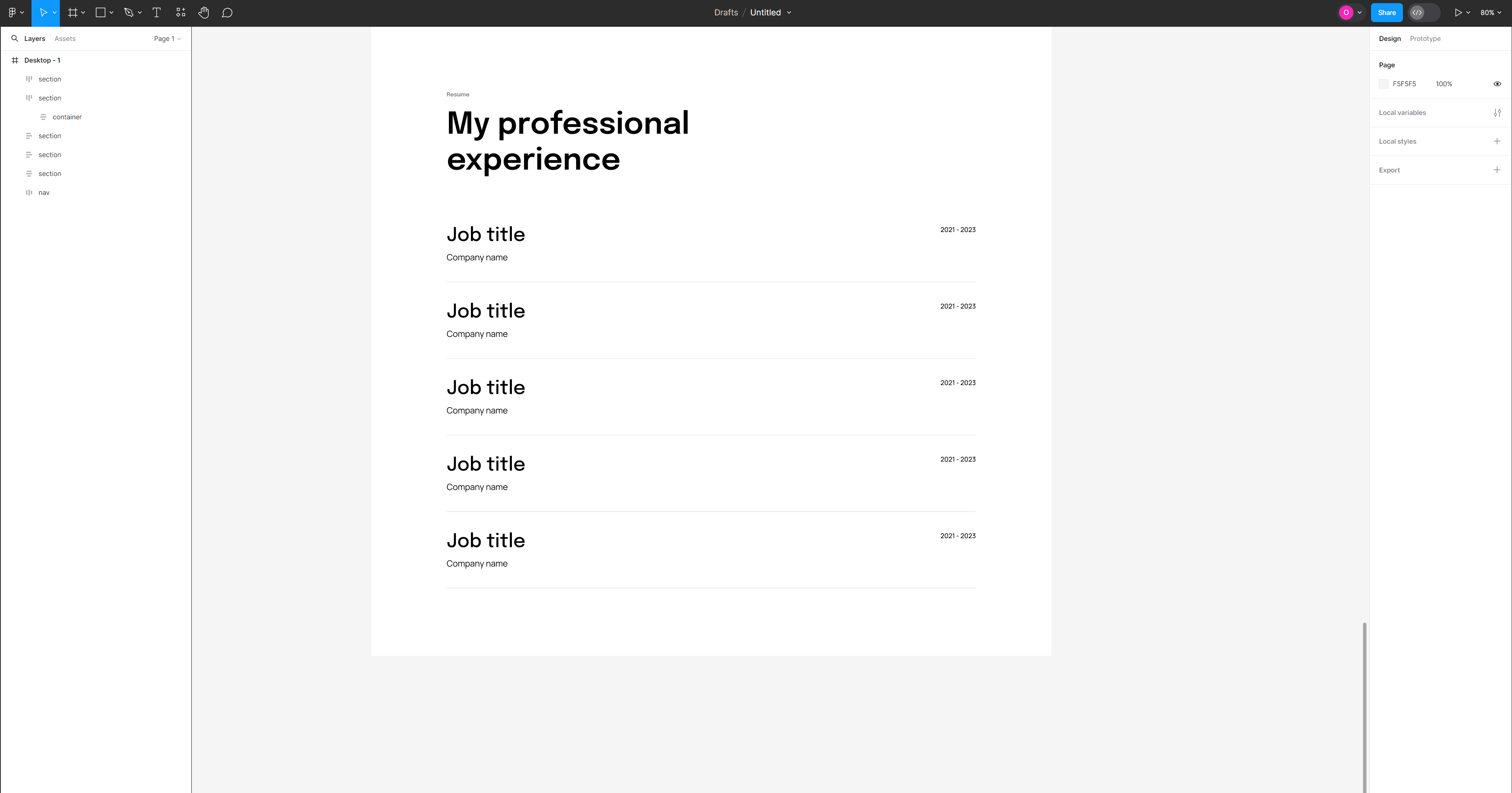
Designing the Resume section
Designing the Resume section
As with the previous section, copy the headings frame from the above section and paste it under it. Change the text of the small heading to resume, the larger heading to My professional experience, and set the width of the frame to 544 pixels.
Select the text tool and type Job title. Set the font to Epilogue, the size to 40 pixels, the weight to Medium, and the line height to 48.
Create another text layer and type Company name. Set the font to Manrope, the size to 18 pixels, the weight to Regular, and the line height to 26.
Select both text layers, create an auto layout frame, and name it job title + company name. Set the Vertical gap between items to 8.
Create another text layer and type range of years, for example, 2021 - 2023. Set the font to Manrope, the size to 14 pixels, the weight to Medium, and the line height to 22.
Select the job title + company name frame and the text with the year range, create an auto layout frame, and name it single experience. Set the Horizontal gap between items of the single experience frame to Auto and duplicate it four more times.
Select all the single experience frames, create a new auto layout frame, and name it experience.
Select headings and the experience frames, create a new auto layout frame, and name it container. While container is selected, create another auto layout frame, name it section, and give it a width of 1440 pixels, Horizontal padding of 160 pixels, and Vertical padding of 0.
Select the container and the experience frames, and set their Horizontal resizing to Fill container. Next, select the experience frame, press ENTER to select all the frames inside it, and set the Horizontal resizing to Fill container.
Grab the line tool, and inside the experience frame, hold the SHIFT key and draw a short line, then set its Horizontal resizing to Fill the container, duplicate it four more times, and place each line or divider under each experience row. Select all the lines/dividers and change the Stroke color to #2C333E with 30% opacity and a size of 0.5.
Select the experience frame and set the Vertical gap between items to 40. Then, select the container frame and set the Vertical gap between items to 96.
Designing the footer
Designing the footer
Select the text tool and type Let's create something awesome together! Set the text font to Epilogue, the weight to SemiBold, the size to 64 pixels, and the line height to 76. Copy the button from the portfolio or hero section, paste it under the heading, and change the text to Let's talk. Select the two layers, create an auto layout frame, name it cta, and change the Vertical gap between items to 32.
Copy the nav frame from the top, paste it under the cta frame, and change the layer's name to footer links. In the right sidebar, change the Horizontal padding of footer links to 0 and the Horizontal resizing to Hug contents. Grab the line tool, hold SHIFT, and draw a short line.
Select footer links, cta, and the line, then create an auto layout frame. Name it container. Create another auto layout frame while the container frame is selected, name it section, give it a width of 1440 pixels, set the Horizontal padding to 160 pixels, and the Vertical padding to 0. Next, set the Horizontal resizing of the container, cta, and footer links frames as well as the line layer to Fill the container. Make sure the Horizontal gap between layers of the footer links frame is set to Auto.
Set the fill color of section frame to #2C333E, and set the Vertical padding of container to 96.
Change the fill color of the heading and the footer links to #FFFFFF (white). Then, select the logo, and on the bottom of the right sidebar, find the section titled Selection colors and change the color to #FFFFFF. Select the line, and change the stroke color to #757575.

Creating a frame for the tablet version
Creating a frame for the tablet version
Now that we have designed the desktop version, let's create designs for smaller screens. Grab the framer tool (F), and in the right sidebar, open the Tablet drop-down and select iPhone Pro 12.9." We need to create a new layout grid for this screen size, so use the following settings:
Count: 12
Type: Stretch
Margin: 80
Gutter: 24

Components
Components
Let's go back to the first design and select the top navigation. Drag it outside of the frame and place it on the canvas. Now, from the actions group in the toolbar, click the Create a Component icon on the left side of the actions group. Notice that the navigation auto layout frame now has a purple border, and in the layers panel, the layer's name is also purple with a designated icon. This means that it's a component now.
Let's go back to the first design and select the top navigation. Drag it outside of the frame and place it on the canvas. Now, from the actions group in the toolbar, click the Create a Component icon on the left side of the actions group. Notice that the navigation auto layout frame now has a purple border, and in the layers panel, the layer's name is also purple with a designated icon. This means that it's a component now.


What are components?
Components are reusable elements that can be used repeatedly throughout our designs. Using components allows us to keep consistent design elements and make changes quickly and efficiently.
A component has two aspects to it.
A main component that defines the properties of the component.
An instance is a copy of the main component that can be reused across designs. Instances are connected to the main component and receive any updates made to the component.
Creating components - Navigation
Creating components - Navigation
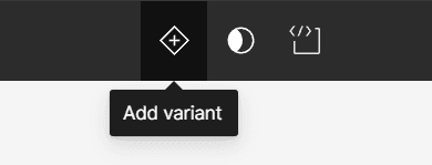
Now, let's create a variant of the main component and customize it. This variant will be the navigation for the new resolution we're working on. Select the navigation component, and in the actions group in the toolbar, click on the Add variant icon on the left of the actions group.
Now, let's create a variant of the main component and customize it. This variant will be the navigation for the new resolution we're working on. Select the navigation component, and in the actions group in the toolbar, click on the Add variant icon on the left of the actions group.
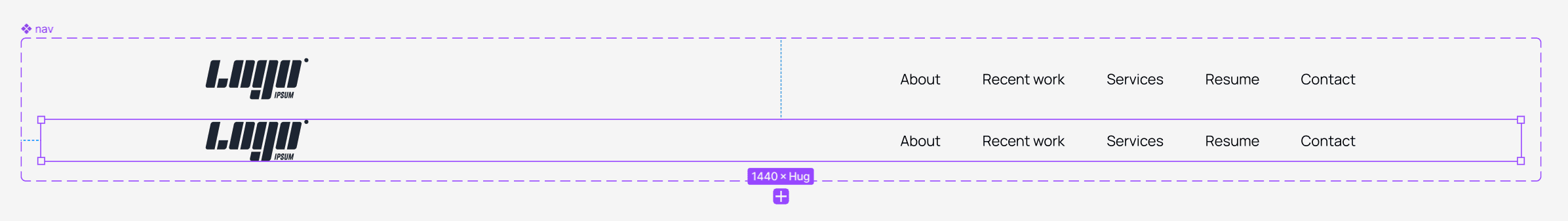
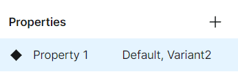
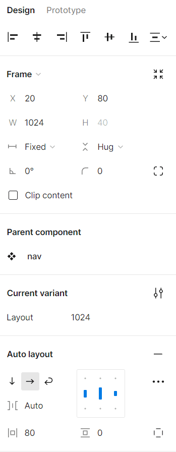
Now, you have two identical navigation menus. Click on the purple border of the component to select the main component, and in the right sidebar, in the Properties section, change Property1 to Layout. Select the top navigation nested in the main component, and in the right sidebar, in the Current variant section, change Default to 1440. Then, select the second navigation menu and change Variant2 in the Current variant section to 1024.
Now, you have two identical navigation menus. Click on the purple border of the component to select the main component, and in the right sidebar, in the Properties section, change Property1 to Layout. Select the top navigation nested in the main component, and in the right sidebar, in the Current variant section, change Default to 1440. Then, select the second navigation menu and change Variant2 in the Current variant section to 1024.


While the second navigation or "1024" is selected, go to the right sidebar and change the width to 1024 in the Frame properties. Then, in the Auto layout section, change Horizontal padding to 80. Why 80? Each column in the new layout grid is evenly spaced, with a margin of 80 pixels on each side of the grid. This means there's a clear space of 80 pixels between the edge of the frame and the nearest grid line on all sides.
While the second navigation or "1024" is selected, go to the right sidebar and change the width to 1024 in the Frame properties. Then, in the Auto layout section, change Horizontal padding to 80. Why 80? Each column in the new layout grid is evenly spaced, with a margin of 80 pixels on each side of the grid. This means there's a clear space of 80 pixels between the edge of the frame and the nearest grid line on all sides.
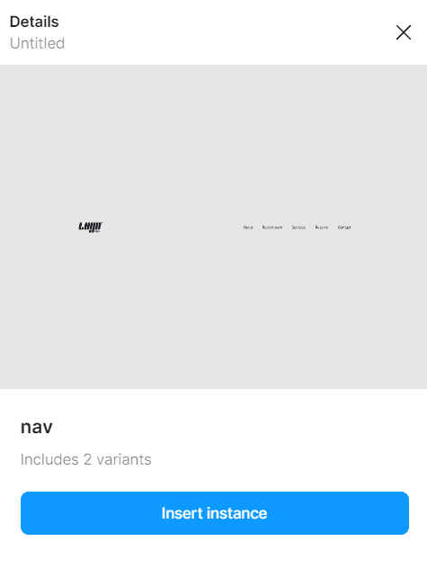
Choose the 1440 frame, and from the left sidebar, select the Assets tab (next to the Layers tab). You should see a Local components drop-down. It should be open by default, but if it's closed, open it, and you should see the component we just created. Click on the component, and a small window will open from the right of the left sidebar. Click on the Insert instance button and move the navigation menu back to where it previously was.
Choose the 1440 frame, and from the left sidebar, select the Assets tab (next to the Layers tab). You should see a Local components drop-down. It should be open by default, but if it's closed, open it, and you should see the component we just created. Click on the component, and a small window will open from the right of the left sidebar. Click on the Insert instance button and move the navigation menu back to where it previously was.
While the instance of the navigation is still selected, copy it and paste it into the 1024 frame. You'll notice that it's too big for this frame. So, from the right sidebar, look for the nav section (or whatever you named your navigation menu), click on the drop-down (where it says 1440), and select the 1024 variant.
While the instance of the navigation is still selected, copy it and paste it into the 1024 frame. You'll notice that it's too big for this frame. So, from the right sidebar, look for the nav section (or whatever you named your navigation menu), click on the drop-down (where it says 1440), and select the 1024 variant.


Now, you can see the power of components and variants in Figma and how they can improve our work and save us time.
Before we move on, let's keep our file organized by moving the component we created to a designated page. To do that:
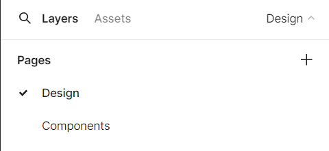
Go to the left sidebar and open the drop-down where it says Page 1. You'll see a section called Pages and the page name you are currently working on.
Double-click on the page name and change it to Design.
Click on the plus icon to add a new page, and call it Components.
Cut the navigation component from the design page and paste it into the components page.
Now, you can see the power of components and variants in Figma and how they can improve our work and save us time.
Before we move on, let's keep our file organized by moving the component we created to a designated page. To do that:
Go to the left sidebar and open the drop-down where it says Page 1. You'll see a section called Pages and the page name you are currently working on.
Double-click on the page name and change it to Design.
Click on the plus icon to add a new page, and call it Components.
Cut the navigation component from the design page and paste it into the components page.
Return to the design page, cut the welcome message section, and paste it into the components page. Click the Create a component icon in the actions group or use the keyboard shortcut. CTRL + ALT + K (Windows) or OPTION + COMMAND + K (Mac). Change the name of the component from section to hero. Click the Add variant icon from the actions group to create a new variant.
Return to the design page, cut the welcome message section, and paste it into the components page. Click the Create a component icon in the actions group or use the keyboard shortcut. CTRL + ALT + K (Windows) or OPTION + COMMAND + K (Mac). Change the name of the component from section to hero. Click the Add variant icon from the actions group to create a new variant.
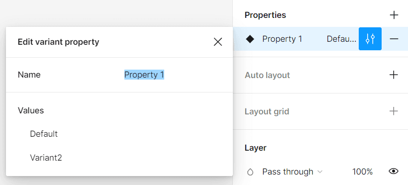
Select the hero component, and in the properties section in the right sidebar, change Property1 to Layout. Next to the delete property icon, you'll find the edit property icon. Click on it and change Default to 1440 and Variant2 to 1024 in the Values section.
Select the hero component, and in the properties section in the right sidebar, change Property1 to Layout. Next to the delete property icon, you'll find the edit property icon. Click on it and change Default to 1440 and Variant2 to 1024 in the Values section.
Select the 1024 variant, and change its width size to 1024 and the Horizontal padding to 80. Click on the h1 layer and change its Horizontal resizing to Fill container. Now, the header is too big, so adjust the size to 72 pixels and the line height to 88. Open the design page and get the hero component instance from the Assets tab in the left sidebar. Return the hero section to its previous position, copy the instance, and paste it into the 1024 frame.
From the right sidebar, change the layout to 1024 in the hero section.
Creating components - About section
Creating components - About section
Cut the about me section from the 1440 width frame in the design page and paste it into the components page. Create a component with the keyboard shortcut CTRL + ALT + K (Windows) or OPTION + COMMAND + K (Mac), and name it about me. Click the Add variant button, and then select the main component. In the Properties section on the right sidebar, change Property1 to Layout, and then click on the Edit property icon, change Default to 1440 and Variant2 to 1024 in the Values section.
Select the 1024 variant, change its width to 1024 pixels, and Horizontal padding to 80 pixels from the right sidebar. Select the h2 text layer, and change the font size to 56 pixels and the line height to 68.
In the images grid, select the image wrapper layers on each side, and change their width to 198 pixels, and the height to 250 pixels. Select the image wrapper layer in the center, and set its Horizontal and Vertical resizing to Fill container. Select the image grid layer, change Horizontal resizing to Fill container, and Horizontal gap between items to 24. Select the right and left layers, and change the Vertical gap between items to 24.
Select the about content layer, change Horizontal resizing to Fill container, and Horizontal gap between items to 96. Select the p text layer inside the text frame, and set Horizontal resizing to Fill container. Set the Horizontal and Vertical padding of the text frame to 0.
Open the design page, go to the Assets tab in the left sidebar, and Insert an instance of the about me component to the 1440-width frame. Copy the instance and paste it into the 1024-width frame. While the about me instance is selected, change the layout to 1024 from the about me section in the right sidebar and adjust it correctly on the frame.
Creating components - Services section
Creating components - Services section
Cut the services section from the 1440-width frame and paste it into the components page. Create a component by using the keyboard shortcut CTRL + ALT + K (Windows), or OPTION + COMMAND + K (Mac), change the component name to services, then click on the Add variant icon from the actions group in the toolbar.
Select the main component, go to the Properties section in the right sidebar, and click on the Edit property icon. In the window that opened, change the name field to Layout, and in the Values section below, change Default to 1440 and Variant2 to 1024.
Select the 1024 variant, change its width to 1024 pixels, and Horizontal padding to 80. Change the h2 text layer size to 56 pixels and the line height to 68.
Go to the design page and insert an instance of the services component to the 1440-width frame. Then, copy the instance, paste it into the 1024-width frame, and change the layout to 1024 from the right sidebar.
Creating components - Portfolio section
Creating components - Portfolio section
Cut the portfolio section from the 1440-width frame and paste it into the components page. Create a component using the keyboard shortcut CTRL + ALT + K (Windows), or OPTION + COMMAND + K (Mac), change the component name to portfolio, then click on the Add variant icon from the actions group in the toolbar.
Select the main component, go to the Properties section in the right sidebar, and click the Edit property icon. In the opened window, change the name to Layout, and in the Values section below, change Default to 1440 and Variant2 to 1024.
Select the 1024 variant, change its width to 1024 pixels, and Horizontal padding to 80 pixels. Change the h2 text layer size to 56 pixels and the line height to 68.
Select the projects frame nested in the container frame, press ENTER to select all project frames inside it and set their width to 420 pixels.
Select the project frame again, set Horizontal resizing to Fill container, and change the Horizontal & Vertical gap between items to 24.
Select project info and project image wrapper frames in all the project frames and set Horizontal resizing to Fill container.
Return to the design page, open the Assets tab from the left sidebar, insert an instance of the portfolio component into the 1440-width frame, and adjust it correctly. Then, copy the instance, paste it into the 1024-width frame, change the layout to 1024 from the right sidebar, and adjust it correctly in the frame.
Creating components - Resume section
Creating components - Resume section
Cut the resume section from the 1440-width frame and paste it into the components page. Create a component using the keyboard shortcut CTRL + ALT + K (Windows), or OPTION + COMMAND + K (Mac), change the component name to resume, then click on the Add variant icon from the actions group in the toolbar.
Select the main component, go to the Properties section in the right sidebar, and click the Edit property icon. In the opened window, change the name to Layout, and in the Values section below, change Default to 1440 and Variant2 to 1024.
Select the 1024 variant, change its width to 1024 pixels, and Horizontal padding to 80 pixels. Change the h2 text layer size to 56 pixels and the line height to 68.
Return to the design page, open the Assets tab from the left sidebar, insert an instance of the resume component into the 1440-width frame, and adjust it correctly. Then, copy the instance, paste it into the 1024-width frame, change the layout to 1024 from the right sidebar, and adjust it correctly in the frame.
Creating components - Footer
Creating components - Footer
Cut the footer from the 1440-width frame and paste it into the components page. Create a component using the keyboard shortcut CTRL + ALT + K (Windows), or OPTION + COMMAND + K (Mac), change the component name to footer, then click on the Add variant icon from the actions group in the toolbar.
Select the main component, go to the Properties section in the right sidebar, and click the Edit property icon. In the opened window, change the name to Layout, and in the Values section below, change Default to 1440 and Variant2 to 1024.
Select the 1024 variant, change its width to 1024 pixels, and Horizontal padding to 80 pixels. Change the h2 text layer size to 56 pixels and the line height to 68.
Return to the design page, open the Assets tab from the left sidebar, insert an instance of the footer component into the 1440-width frame, and adjust it correctly. Then, copy the instance, paste it into the 1024-width frame, change the layout to 1024 from the right sidebar, and adjust it correctly in the frame.
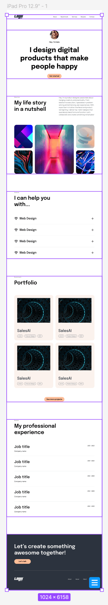
Create a frame for the mobile version
Create a frame for the mobile version
Now it's time to create a mobile version of our project. So select the frame tool (F), and from the right sidebar, open the Phone drop-down and select the iPhone 14 & 15 Pro Max (430 X 932) frame.
Select the phone frame and add a layout grid. Here are the settings I used to create a layout for this resolution:
Count: 4
Type: Stretch
Margin: 16
Gutter: 32

Open the components page and create another variant in the navigation component. Name this variant 430, and change the width size of the frame to 430 and Horizontal padding to 16.
Open the Material Symbols plugin, type in the search bar "menu," and insert a menu icon. Once inside the canvas, change the width and height to 32. Cut or copy the icon, select the links frame inside the 430 variant, right-click on the links frame, and select Paste to replace. This will replace the links in the navigation with the menu icon.
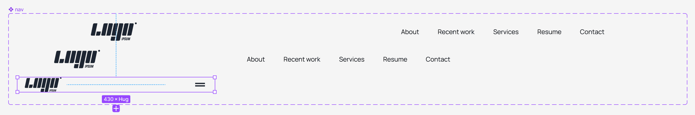
Select the logo and change the height to 32 pixels. Return to the design page and insert an instance of the navigation component to the 430 frame. From the right sidebar, change the layout to 430.
Now let's move on to the hero section.
Go to the components page and create another variant of the hero component. Name this variant 430, and change the width size of the frame to 430 and Horizontal padding to 16. Change the heading size to 48, the line height to 56, and Horizontal resizing to Fill container. Select the button and change Horizontal resizing to Fill container.
Return to the design page and insert an instance of the hero component to the 430 frame. From the right sidebar, change the layout to 430.
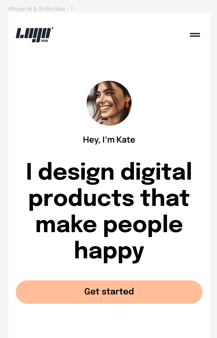
Go to the components page and create another variant of the about me component. Name this variant 430, and change the width size of the frame to 430 and Horizontal padding to 16.
Select the about content layer, change the Horizontal resizing to Fill container, the Vertical resizing to Hug contents, and the direction to Vertical layout. Select the p text layer inside the text frame, and change Horizontal resizing to Fill container.
Select the headings layer, change the Horizontal resizing to Fill container, and the Vertical resizing to Hug contents. Select the about content layer and change the Vertical gap between items to 24.
Select the h2 text layer and change its size to 40 pixels with a line height of 48 pixels.
Select the image grid layer, change the Horizontal resizing to Fill container and change the direction to Vertical layout. Press ENTER (to select the left, center, and right layers) and set the Horizontal resizing to Fill container. Then, press ENTER again (to select all the image wrapper layers) and set the Horizontal resizing to Fill container.
Select the container frame and change the Vertical gap between items to 64. Return to the design page and insert an instance of the about me component to the 430 frame. From the right sidebar, change the layout to 430
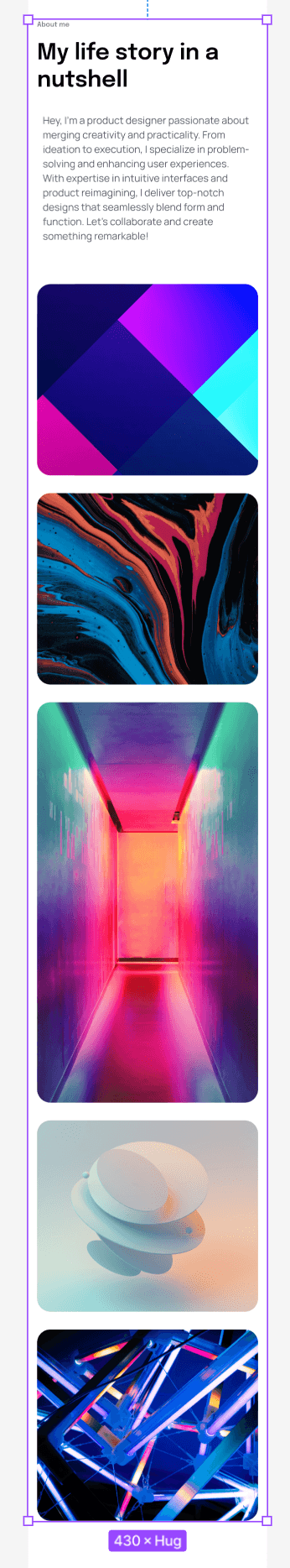
Go to the components page and create another variant of the services component. Name this variant 430, and change the width size of the frame to 430 and Horizontal padding to 16. Select the h2 text layer and change its size to 40 pixels with a line height of 48 pixels.
Select the headings frame, change the Horizontal resizing to Fill container, and the Vertical resizing to Hug contents.
Select all the text layers inside the icon + service name frame, and set the font size to 24 pixels and the line height to 34. Name these text layers h4. Change the icon height and width to 32 pixels. Ensure the settings in the alignment box are set to the left or the center. Change the size of the plus icon to 32 by 32 pixels.
Return to the design page and insert an instance of the the services component to the 430 frame. From the right sidebar, change the layout to 430.
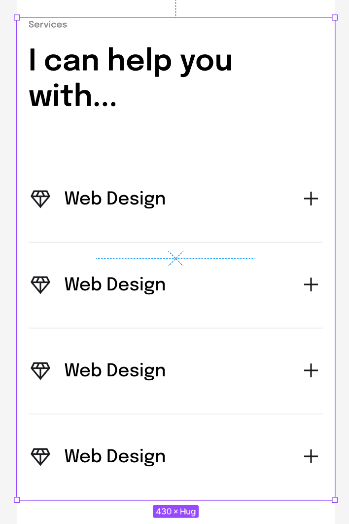
Go to the components page and create another variant of the portfolio component. Name this variant 430, and change the width size of the frame to 430 and Horizontal padding to 16. Select the h2 text layer and change its size to 40 pixels with a line height of 48 pixels.
Select the projects frame, and set it to Vertical layout. Select all the h3 text elements inside each project info frame, set the Horizontal resizing to Fill container, and change the font size to 32 pixels and the line height to 42. Set the Horizontal resizing of the container frame to Fill container.
Then, select the projects frame, press ENTER (to select all the project frames inside it), and set the Horizontal resizing to Fill container. In the container frame set the Vertical gap between items to 64. Select the button and set the Horizontal resizing to Fill container.
Return to the design page and insert an instance of the the portfolio component to the 430 frame. From the right sidebar, change the layout to 430.
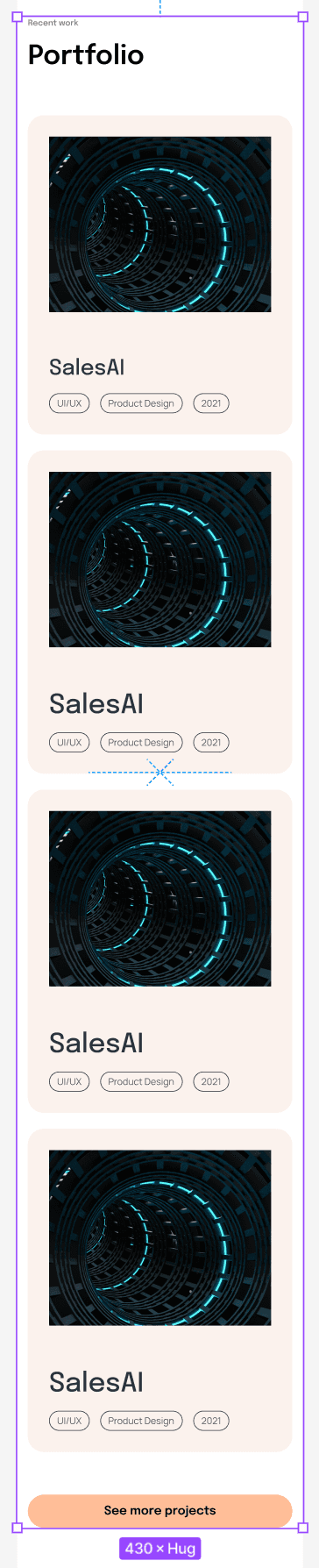
Go to the components page and create another variant of the resume component. Name this variant 430, and change the width size of the frame to 430 and Horizontal padding to 16. Select the h2 text layer and change its size to 40 pixels with a line height of 48 pixels.
Select the headings frame and set the Horizontal resizing to Fill container. Select all the job titles text layers, set their font size to 18 pixels with a line height of 26, and change their name to h5. Select all company name text layers (under the job title) and change their name to p. Then set their font size to 16 pixels with a line height of 26.
Select the container frame and set the Vertical gap between items to 64. Return to the design page and insert an instance of the the resume component to the 430 frame. From the right sidebar, change the layout to 430.
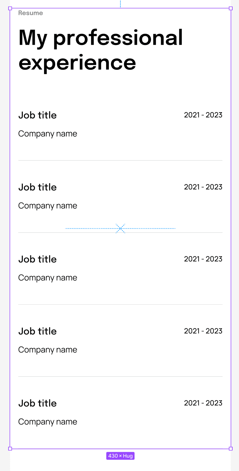
Go to the components page and create another variant of the footer component. Name this variant 430, and change the width size of the frame to 430 and Horizontal padding to 16. Select the h2 text layer change its size to 40 pixels with a line height of 48 pixels, and align the text to the center. Then, set the Horizontal resizing to Fill container. Then, select the button frame and set the Horizontal resizing to Fill container.
Select the footer links frame, set the direction to Vertical layout, the Vertical gap between items to 40, and set the alignment box to Align top center.
Return to the design page and insert an instance of the footer component into the 430 frame. From the right sidebar, change the layout to 430.
Designing the project page
Now, we will create the project page, which you can use to showcase your design process, skills, expertise, and experience.
The first thing we need to do is to create a new frame for the new page. Go ahead and select the frame tool (F). From the right sidebar, choose the Desktop frame from the Desktop drop-down. Then, change the frame height by dragging it vertically, as seen in the video.
Select the main home page frame, and from the right sidebar, in the Layout grid properties, click on the Styles icon, and in the window that opens, click the Create style icon (plus icon). Give a name to this style, for example, 1440 grid, and click on the Create style button. Now you have a grid style you can reuse whenever you need for a 1440-width frame instead of creating a new one every time.
Select the main home page frame, and from the right sidebar, in the Layout grid properties, click on the Styles icon, and in the window that opens, click the Create style icon (plus icon). Give a name to this style, for example, 1440 grid, and click on the Create style button. Now you have a grid style you can reuse whenever you need for a 1440-width frame instead of creating a new one every time.
Go to the project page frame, and from the right sidebar, click on the Styles icon, and select the grid style you've just created.
Insert a new instance of the nav component from the Assets tab on the left sidebar to the new page, or copy it from the home page frame.
Copy the h1 heading from the home page frame and paste it into the new project frame. Change the text to "Project name". Then, create a new text layer, type "Short description of the project," and from the left sidebar, change the layer's name to p. Make sure to set the font to Manrope, the size to 24 pixels, the line height to 34, and the weight to Regular.
Select the h1 and p text layers, create a new auto layout frame, and name it headings. Set the Vertical gap between items to 24. Insert an image either from your hard drive or from the Unsplash plugin, create a new auto layout frame and name it "featured image".
Select the featured image and the headings frames, create a new auto layout frame, and name it "hero". Set Horizontal padding to 160, and the frame width to 1440. Align the frame horizontally by using the keyboard shortcut ALT + H (Windows), or OPTION + H (Mac), then select the featured image frame, set Horizontal resizing to Fill container and the height to 640. Select the image inside the featured image frame and make sure Horizontal and Vertical resizing is set to Fill the container. Ensure the Horizontal and Vertical padding in the featured image frame are set to 0.
Select the hero frame, and set the Vertical gap between items to 64. Select the featured image frame again, set the Corner radius to 24, and ensure Clip content is checked.
Now we'll create the overview section of the project page. This is where visitors can see a brief description of your project.
Insert a new instance of the about me component or copy it from the main page and paste it into the project page. Press CTRL + ALT + B (Windows), or OPTION + COMMAND + B (Mac) to detach the instance from the component, and then press CTRL + Backspace (Windows), or COMMAND + Delete (Mac) to ungroup the about me auto layout frame, and then ungroup the container auto layout frame. Delete the image grid frame.
Now what's left is only the about content auto layout frame. Change it's name to heading + description. Change the Horizontal gap between items to 32. Select the headings frame and set Horizontal resizing to Fill container. Delete the about me text that's above the main heading. Select the text layer inside the text frame and set the Horizontal resizing to Fill container. Select the text frame and set the Horizontal and Vertical padding to 0.
Change the text of the heading to Overview and you can leave the text next to it unchanged or use your own texts.
Select the text tool and type the word "client." Set the font to Epilogue, the size to 18 pixels, the weight to SemiBold, and the line height to 26. Duplicate the text layer you've just created (CTRL/COMMAND + D) and change the font to Manrope, the size to 14, the weight to Regular, and the line height to 22. Change the text to "Client's name."
Select both text layers and create a new auto layout frame. Name this frame project detail and duplicate it three more times. Select all the project detail frames and create a new auto layout frame. Call this frame project details container.
Select heading + description and project details container frames, create a new auto layout frame, and name it container. While the container frame is selected, create another auto layout frame and name it section.
Set the width of the section frame to 1440, align Horizontal centers by pressing ALT + H (Windows), or OPTION + H (Mac) and set Horizontal padding to 160. Select the project details container, and set the Horizontal resizing to Fill container. Press Enter to select it's children, set the Horizontal resizing to Fill container, and set the Horizontal gap between items to Auto.
Grab the line tool (L), create a line inside the project detail container frame, and duplicate it twice. Select all the lines and change their Horizontal resizing to Fill container. Select the project details container frame, and set the Vertical gap between items to 24.
Select the container frame and set the Vertical gap between items to 64. Select all the lines and change the stroke color to #2C333E, the opacity to 30%, and the size to 0.5.
Next, we have a section that is nothing but text, so let's copy only the heading + description frame from the section we've just designed and paste it below. You can duplicate this frame as much as you need and change the content accordingly.
Now, let's design a section with text and images. This will be a section for user and market research. So the first things we'll need to do is to duplicate the heading + description frame, and change the heading text to User research. Then, you can bring an image to Figma, either from your hard drive or from a plugin such as Unsplash. Once the image is in Figma, create a new auto layout frame, name it image wrapper, set Horizontal and Vertical padding to 0 and set the Horizontal and Vertical resizing of the image inside to Fill container.
Duplicate the heading + description frame again, and change the heading text to Market research. Now, let's create an image grid of four images. Duplicate the image wrapper frame from above four more times. Select all the image wrapper frames you've duplicated, and create an auto layout frame. Name this frame images grid.
Press ENTER when the images grid frame is selected to select all it's children (the image wrapper frames), and change their width to 544 pixels and height to 320 pixels. Then, set the images grid frame to Wrap, just like in the clip below:
Press ENTER when the images grid frame is selected to select all it's children (the image wrapper frames), and change their width to 544 pixels and height to 320 pixels. Then, set the images grid frame to Wrap, just like in the clip below:
Next, select the heading + description frames, the images grid frame, and the image wrapper frame, create a new auto layout frame, and name it container. While container is selected create another auto layout frame and name it section.
Set the width of section to 1440 pixels, the Horizontal padding to 160, and align Horizontal centers by pressing the ALT + H keyboard shortcut (Windows), or OPTION + H (Mac). Next, select the container frame and set the Horizontal resizing to Fill container.
Select image wrapper, set the Horizontal resizing to Fill container and its height to 640 pixels. Then, select the images grid frame, set the Horizontal resizing to Fill container, Horizontal gap between items and Vertical gap between items to 24.
Select the image wrapper frame set Corner radius to 24 and ensure that Clip content is checked. Do the same process to the image wrapper frames inside images grid.
Select the section frame and fill the background with the following color: #FBF2ED. Then select the container frame, set the Vertical gap between items to 96 and Vertical padding to 128. This is what you should be getting:
Select the section frame and fill the background with the following color: #FBF2ED. Then select the container frame, set the Vertical gap between items to 96 and Vertical padding to 128. This is what you should be getting:
Conclusion
Conclusion
Alright, we're done with this tutorial, but there's still some work left. Here's a challenge for you: First, complete the project page. You can check out the file I created in Figma to see how I designed it or come up with something of your own using the skills you've learned here.
Alright, we're done with this tutorial, but there's still some work left. Here's a challenge for you: First, complete the project page. You can check out the file I created in Figma to see how I designed it or come up with something of your own using the skills you've learned here.
The second thing I want you to do is to create a 1024-width and 430-width frame of the project page, just like we did for the homepage. With all the new skills and knowledge you've picked up, this should be a breeze. I know you can do it!
The second thing I want you to do is to create a 1024-width and 430-width frame of the project page, just like we did for the homepage. With all the new skills and knowledge you've picked up, this should be a breeze. I know you can do it!
If you need any help or have any questions, don't hesitate to contact me by email at ofir@uxuikit.com or on LinkedIn. I'm always happy to help out in any way that I can.
If you need any help or have any questions, don't hesitate to contact me by email at ofir@uxuikit.com or on LinkedIn. I'm always happy to help out in any way that I can.

Let’s take your project to the next level
I'd love to hear your ideas and work together to make something awesome!
Follow me
Let’s take your project to the next level
I'd love to hear your ideas and work together to make something awesome!
Follow me
Let’s take your project to the next level
I'd love to hear your ideas and work together to make something awesome!
Follow me
Let’s take your project to the next level
I'd love to hear your ideas and work together to
make something awesome!
Follow me
Let’s take your project to the next level
I'd love to hear your ideas and work together to make something awesome!
Follow me
Let’s take your project to the next level
I'd love to hear your ideas and work together to make something awesome!
Follow me
Menu
Menu